%20--%3e%3csvg%20width='63.297821mm'%20height='39.29665mm'%20viewBox='0%200%2063.297821%2039.29665'%20version='1.1'%20id='svg8765'%20inkscape:version='1.1%20(c4e8f9ed74,%202021-05-24)'%20sodipodi:docname='OBALogoSingle2.svg'%20xmlns:inkscape='http://www.inkscape.org/namespaces/inkscape'%20xmlns:sodipodi='http://sodipodi.sourceforge.net/DTD/sodipodi-0.dtd'%20xmlns='http://www.w3.org/2000/svg'%20xmlns:svg='http://www.w3.org/2000/svg'%3e%3csodipodi:namedview%20id='namedview8767'%20pagecolor='%23ffffff'%20bordercolor='%23666666'%20borderopacity='1.0'%20inkscape:pageshadow='2'%20inkscape:pageopacity='0.0'%20inkscape:pagecheckerboard='0'%20inkscape:document-units='mm'%20showgrid='false'%20fit-margin-top='0'%20fit-margin-left='0'%20fit-margin-right='0'%20fit-margin-bottom='0'%20inkscape:zoom='1.1759259'%20inkscape:cx='179.85827'%20inkscape:cy='102.04724'%20inkscape:window-width='1920'%20inkscape:window-height='972'%20inkscape:window-x='0'%20inkscape:window-y='27'%20inkscape:window-maximized='1'%20inkscape:current-layer='layer1'%20/%3e%3cdefs%20id='defs8762'%20/%3e%3cg%20inkscape:label='Layer%201'%20inkscape:groupmode='layer'%20id='layer1'%20transform='translate(-31.351095,-50.101677)'%3e%3cpath%20style='fill:none;stroke:%233584e4;stroke-width:3.965;stroke-linecap:square;stroke-linejoin:round;stroke-miterlimit:4;stroke-dasharray:none;stroke-opacity:1'%20d='m%2077.07508,77.78787%2014.84134,8.87817%20V%2052.83397%20L%2034.08359,86.5521%20V%2053.69366%20l%2015.27351,9.31107'%20id='path8388'%20sodipodi:nodetypes='cccccc'%20/%3e%3c/g%3e%3c/svg%3e)
Researching one stock is straightforward. Comparing four is where it gets messy. You open a tab for each company, write down the P/E ratios, try to remember which one had the better margins, then lose the thread halfway through. A stock comparison tool fixes that by putting the companies into one framework.
Openbook's comparison view lets you compare UK stocks side by side across factor scores, valuation, performance, dividend yield and risk. This guide uses four FTSE 100 names, HSBC, AstraZeneca, Shell and Unilever, to show how the tool turns a shortlist into a clearer research question.
Open the stock comparison tool
Compare UK stocks online
To compare UK stocks online well, the tool needs more than price charts. It should put each company into the same framework, then show where the difference comes from: valuation, dividend yield, growth, profitability, momentum and risk. That is especially useful with FTSE 100 stocks because a bank, a drugmaker, an oil major and a consumer staples company can look attractive for completely different reasons.
Openbook is built for that kind of comparison. You can compare HSBC, AstraZeneca, Shell and Unilever in one view, read the strongest and weakest factor scores, then open the full research page for whichever stock deserves more work.
How to compare stocks side by side
To compare stocks side by side, put two to four companies into the same framework, then compare valuation, performance, growth, profitability, dividend yield and risk. The goal is not to find an automatic winner, but to see which trade-offs matter enough to research further.
| Question | Metric to compare |
|---|---|
| Which stock is cheaper? | P/E ratio and Value score |
| Which business scores better? | Reward, Growth and Profitability |
| Which has performed better? | Rebased 1-year or 3-year return |
| Which pays more income? | Dividend yield |
| Which carries more risk? | Risk score and volatility signals |
If you are starting from a large universe, use the free stock screener first, then compare the shortlist. If you are still learning the process, our guide on how to screen stocks explains how to build that shortlist before you compare it.
What the comparison tool shows
The comparison view stacks up to four stocks across eleven metrics, arranged in three layers.
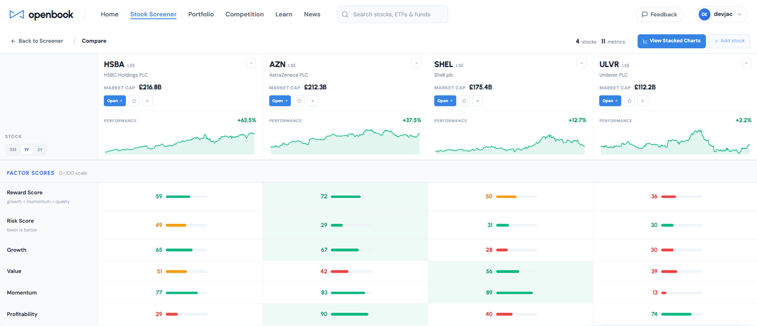
At the top sit the header cards: company, market cap and price performance over your chosen period, with a 3-month, 1-year or 3-year toggle and a small chart for each.
Below that are the Factor Scores, all on a 0 to 100 scale: the headline Reward and Risk scores, then the four reward factors behind them, Growth, Value, Momentum and Profitability. The strongest stock in each row is highlighted, so the leader on any single factor is obvious at a glance.
Underneath sit the Fundamentals: market cap, P/E ratio, dividend yield, sector and industry. Together that is eleven points of comparison in one screen, with no spreadsheet to build.
A worked comparison: four FTSE 100 stocks
Take four of the most familiar UK-listed companies: HSBC, AstraZeneca, Shell and Unilever. A bank, a drugmaker, an oil major and a consumer staples group. That mix is useful because the comparison does not just rank similar businesses; it shows different kinds of trade-off.
AstraZeneca leads on quality and reward in this snapshot. Its Reward score is the highest of the four and its Risk score is the lowest, helped by a standout Profitability score. The valuation tells the other side of the story: a P/E near 28 and a dividend yield around 1.6 per cent mean investors are paying up for that quality.
HSBC is the income and value contrast. A P/E around 14 and a dividend yield around 4.4 per cent make it the cheapest income option in the group, but its Risk score is higher than AstraZeneca's and the business is exposed to a very different set of drivers.
Shell sits between those two stories. It is cheap on earnings and strong on recent momentum, but weak growth means the headline Reward score does not lead the group. Unilever adds the defensive-consumer angle: steadier sector exposure, a reasonable yield, but weaker recent momentum in this comparison.
The value of the tool is not that it declares a winner. It shows the trade-offs in seconds, where reading four separate pages would take far longer and make it easier to miss the pattern.
Reading the performance chart
Click View Stacked Charts and the price lines appear on one chart, each rebased to zero at the start of the selected range. That matters because it compares percentage performance, not share prices. A stock trading at 1,000p is not automatically cheaper or better than one trading at 10,000p; the rebased chart shows how each holding moved from the same starting point.
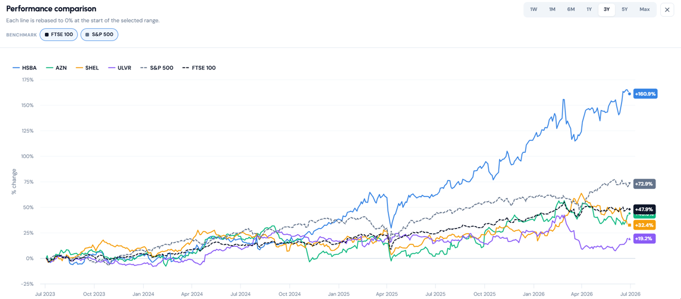
In this example, HSBC has been the strongest performer over the selected 3-year period, while AstraZeneca, Shell and Unilever show very different paths. That does not make HSBC the best stock automatically. It tells you the next question: has the stronger performance been backed by better fundamentals, or has the market simply re-rated the shares?
That is why comparison works best alongside the full stock pages. The chart shows relative movement. The factor scores and fundamentals help explain what may be behind it.
The edge read
The At a Glance panel reads the whole comparison and tags each stock's edge in plain language. In this example, HSBC is flagged as Cheapest plus Income, AstraZeneca as Quality plus Reward, while Shell and Unilever show No Clear Edge.
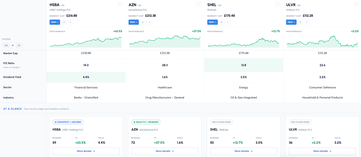
That tag is not a verdict. It is a fast read of where each name leads, drawn from the scores and fundamentals, and it works best as a prompt for the next question. Why does one stock carry a quality edge? Is the cheaper one cheap for a reason? Is a high yield backed by cash flow, or is the market pricing in risk?
For income-focused research, pair this with our guide to FTSE 100 high dividend yield stocks. For growth-focused research, compare the results with our UK growth stocks note.
How to use it
The workflow is simple. Search for the companies you are weighing and add them, up to four. Read the differences across scores, valuation, performance and risk. Then open each company's full research page for the financials and score drivers behind the headline numbers.
It works best after screening. The screener gets you from the whole market to a shortlist. The comparison view lets you put that shortlist side by side. The full stock page is where you do the deeper work. If you are new to the process, start with how to screen stocks, then come back to the comparison tool once you have two to four names worth testing.
Where it fits
Comparison sits between two jobs. The screener gets you from the whole market to a shortlist. Deep research gets you from a single name to a decision. The comparison view is the step in the middle, where you take three or four candidates and work out which trade-off you actually want.
Use the stock comparison tool to narrow the field, expose the trade-offs and decide what deserves a closer look. It is the most practical kind of stock analysis tool: one that ends with a better question, not a false answer.
Discussion
Log in to join the discussion